
About Me
Dedicated Data Analyst with 3+ years of experience leveraging data-driven insights to support business decisions and drive growth.Skilled in analyzing complex data sets and creating visualizations to communicate findings to diverse stakeholders. Possesses strong customer service skills and a proven track record of providing exceptional support to clients. Proficient in Excel, Tableau, Power BI and SQL.A quick learner with excellent attention to detail and a passion for finding solutions to challenging problems. Looking to leverage my skills and experience to make a positive impact in a dynamic and innovative organization.
Skills

Excel | Tableau | Power BI | SQL | Python | Alteryx
Data Visualization - 3+ years
Statistical Data Analysis - 1+ years
Data Services - 1+ years
Report Development - 2+ years
Data Analytics - 2+ years
Data Blending - 1+ years

Excel
DoorDash Project
Utilized Excel to examine marketing trends and generate data visualizations, specifically focusing on the correlation between customers' income levels and their spending patterns.
Tableau
Massachuetts Education Project
Operated Tableau for an in-depth analysis of Massachusetts high schools, aiming to identify the correlations between graduation rates, college attendance, and 4th-grade assessments.

SQL
World Banking Financial Project
Utilized SQL analysis to examine the country's financial situation, its response to challenges such as climate change, and its recovery efforts.
SQL
COVID-19 Project
Orchestrated data of COVID cases in 2020 and found the total cases of vaccinated and death, highest infection and death rate for each country, and highest death count per population in each continent.Coming Soon...

SQL & Power BI
Department Operation Project
Demonstrated a dataset and gave insights, optimized results of each department is at risk of being over budget or under-performing.
Professional Certifications

Alteryx Designer Core Certified | Issued 2024
Excel
DoorDash Project

As the world moves faster, people are increasingly pressed for time. Ordering groceries and meals online has become a convenient solution for many. Despite additional delivery fees, the impact of technology on our lives has made it incredibly easy. With friends frequently using food delivery apps like DoorDash, I became curious about the company's customer base. Through analysis, I looked into how many people were using DoorDash, their age and income, and whether there was any correlation between these factors and their spending behavior.Working on this DoorDash project allowed me to dive deeper into understanding the data behind the food delivery industry. I found that DoorDash is a leading food delivery option in the United States, and as a data analyst, I was challenged to understand the data, find business opportunities and insights, and propose data-driven actions to optimize results and generate value for the company.Why THIS Project?I decided to work on this project for two reasons: curiosity and determination. Why Curiosity you ask you? I was a former DoorDasher. On my days off and even after work, I would use whatever time I have left to DoorDash and gain extra income, and I loved it. The best thing about this is that I can work how many hours I want and receive tips 💰. But I was also curious to know how DoorDash became everyone's favorite app to order food. That is when I came across this project filled with determination; to determine how much each family, each age group, the average income earned and spent in the year 2018.So now let us delve into the depths of data analysis to answer a burning question: how much revenue did this extraordinary food delivery service amass? Driven by a relentless desire for knowledge and determination, I have examined the numbers, delved into trends, and immersed myself in the world of data analysis, all in pursuit of finding the answer. So now…
Through this Analysis, This is what I Discovered: 👀
$1.24 Million was spent on DoorDash/iFood in 2018.
75% of the spend variance can be explained by income levels.
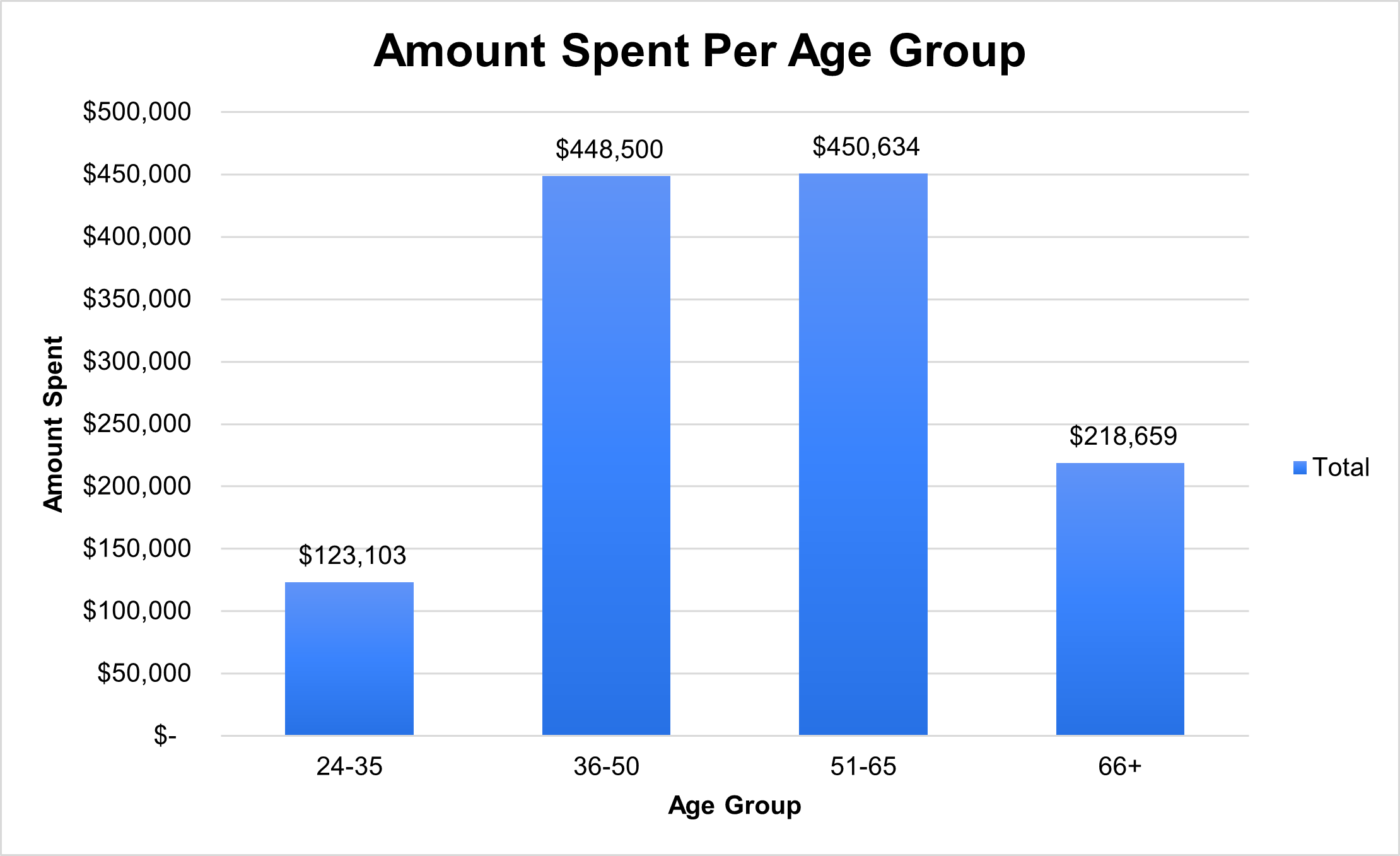
Household Age Groups 36-50 & 51-65 spent more online than instore.
Average Income levels between $40,000 & $60,000 began an increase in customers.
The questions I ask myself to look for in this dataset are:
What's the total amount spent by customers?
What is the amount spent per age group?
What is the average income by each customer in this segment?
How much customers spend Instore vs Online?
What is the Frequency for each Month?
Amount Spent by CustomersIn 2018, customers spent a total of over $1.24 million on food delivery. Out of all the food delivery companies such as UberEats, GrubHub, and Postmates; DoorDash sits at the top in the standings for delivering food to their customers.After receiving this dataset from iFood, it left me wondering, “how many families/customers spend on their yearly salary on food deliveries?”To explore this, I set out to determine whether there is a correlation between customers' income levels and their spending on iFood.To analyze this relationship effectively, I used a scatter plot chart, which is an ideal visual tool for illustrating the values associated between total spent vs. income per customer.
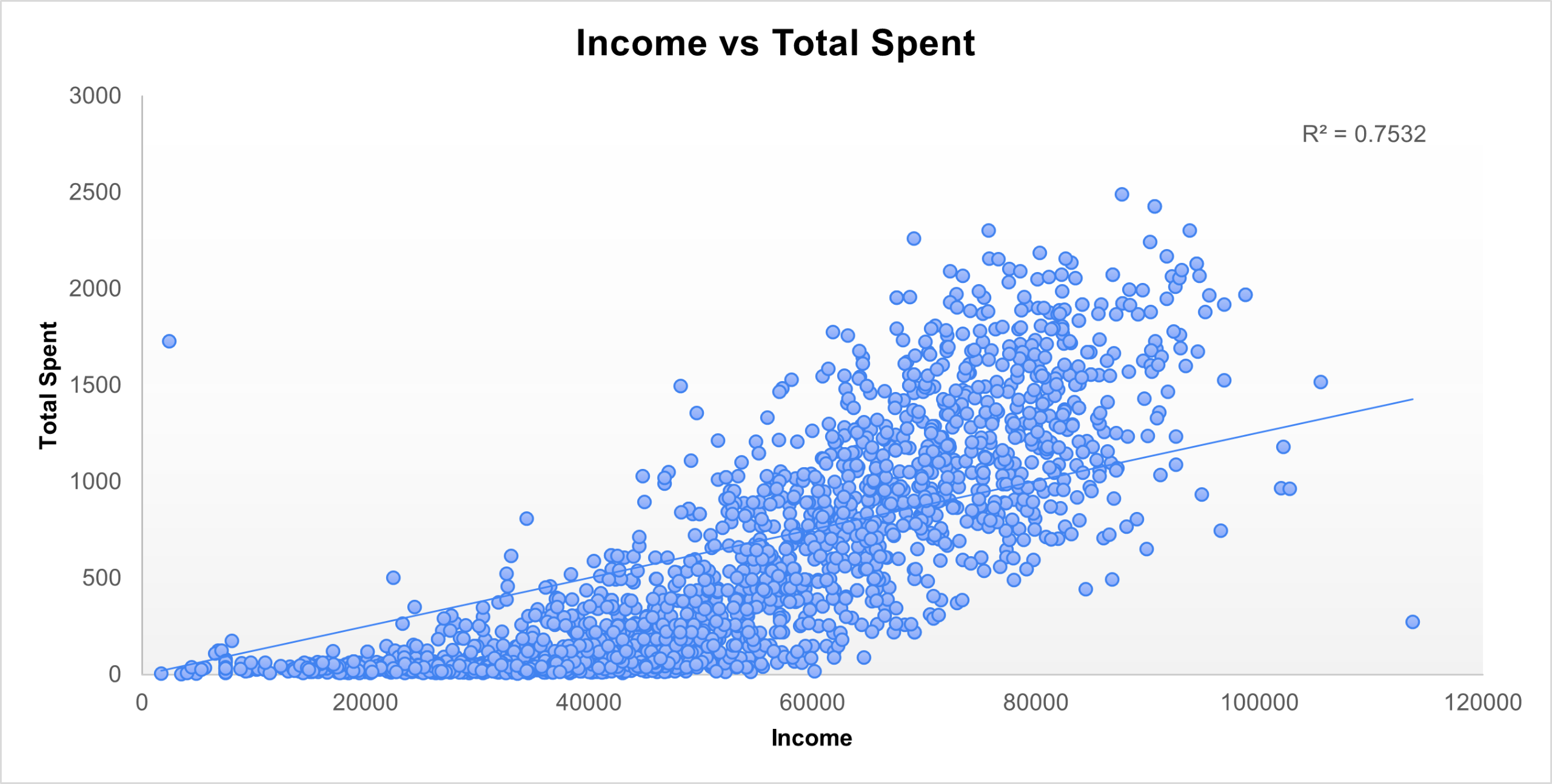
Here, using the scatterplot graph, we can see a pattern as the amount of income increases, as does the total spent on food delivery.This graph also shows a Trendline and R2 Value, which measure how much a customer would spend, and we can determine that 75% of customers Total Spend variance can be explained by the income levels in this graph.Using data visualization helps determine who to target customers using their income/spent levels, and DoorDash figured out who to target. We can see the customers income between $40,000 and $60,000 is a hot zone to capture the audience attention to order more online rather than going to their local fast foods. iFood uses these data to increase its revenue and add more options to get customers to spend more than the Trendline increases.
Amount Spent Per Age GroupFor this section we are going to talk about how much each age group spends. Here in our Bar Chart, we can see Age Group 36-50 & 51-65 has the highest amount spent.
It left me wondering, “Since we determined the total amount of spent of 2205 customers in our dataset, what is the average income per customer?” The bar chart below shows that the income of older customers is generally higher than that of younger customers, based on our data for age group and average income.
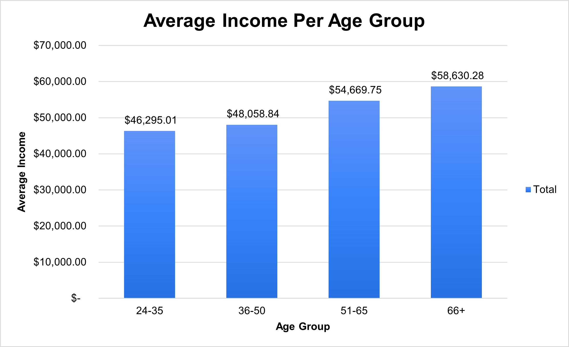
The age groups approximately 51–65 and 66+ have the highest average in this chart, which is no surprise to me. Now, we can both see the charts of the total amount spent and average income, we can now determine whether which age group buys more food in stores or online? For this next section, I’m going to show you a graph that finds what we’re looking for, so here we go.By examining the chart "Average Income Per Age Group", we have the opportunity to find the average income per customer against the total expenditure incurred, encompassing both in-store and online purchases. This analysis leads us to a noteworthy conclusion: a remarkable shift is occurring as customers increasingly gravitate toward online orders, particularly among the age group exceeding 35.
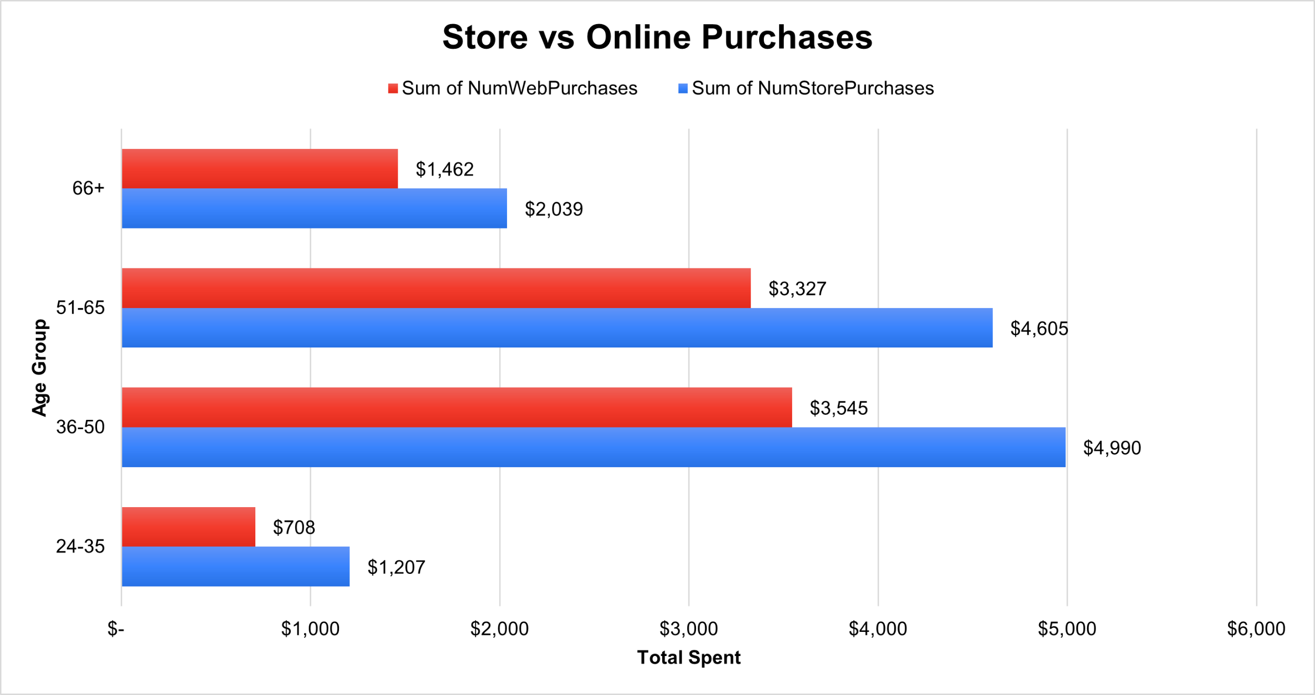
According to our chart, we can see from all age groups that customers purchase both in stores and online, but age groups 36–50 and 51–65 spend a little more than other age groups. Now, we add together the total amount spent on both NumWebPurchases and NumStorePurchases variables.Age Group 24-35: $708 + $1207 = $1915
Age Group 36-50: $3545 + $4990 = $8535
Age Group 51-65: $3327 + $4605 = $7932
Age Group 66+: $1462 + $2039 = $3501After looking at the last two charts for convenience, iFood has made commendable strides in advertising, urging individuals to embrace the DoorDash app and embark on the realm of online ordering. It affirms the evolving landscape of food delivery and the successful endeavors undertaken to cater to the changing preferences and needs of customers.
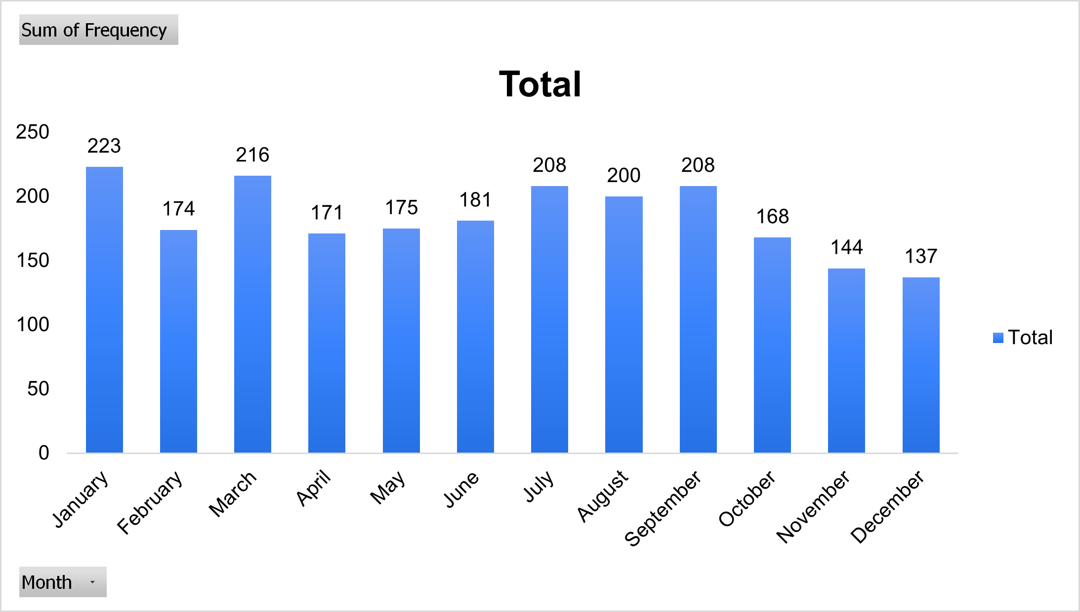
Number of Frequencies per Month 👪In this section, we will discuss the monthly influx of customers and their frequency of joining. The bar graph below presents a comprehensive depiction of the number of new customers gained over the course of the year. Notably, January emerges as the pinnacle month, welcoming the highest number of fresh faces into the year.Then we can see other months such as March through July are having a steady increase. However, as we tread into the realms of October through December, the customer count dwindles to its lowest point. Remarkably, the overall average of new customers acquired each month over the year amounts to an impressive 184%, showcasing both excellence and consistency.These data show how DoorDash/iFood improved its consistency to have customers enjoy online deliveries. It really is an amazing achievement for iFood to view its dataset to see how much of an impact it has made and still continuing to be the best food delivery on the market.
Overall Key Points on this journey 🗝In 2018, the collective spending of consumers on iFood amounted to a staggering $1.24 million, solidifying its position as one of the most lucrative food delivery services today. The landscape of mobile food delivery has undergone a transformation, with the convenience and accessibility it offers becoming increasingly acceptable and widespread, particularly following the disruptive COVID-19 pandemic. Since then, online food delivery has become more reasonable and sustainable in our daily lives.Delving deeper into the data, a surprising statistic showed that income levels exerted a significant influence, accounting for 75% of the variability in consumer expenditure. We also figured out the average income per age group, the total amount spent, and the amount spent whether in stores or online. After carefully analyzing the data, we can see that more customers started downloading the DoorDash app each month. Giving us an average of 184% increase in new and repeated customers!
What I learned 🧠This DoorDash/iFood Excel project simulates a data analyst's task of understanding data, finding business opportunities and insights, and proposing data-driven actions to optimize results and generate value for the company. The project involves various tasks such as data filtering, sorting, aggregation, formulas, graphs, and pivot tables. The data dictionary lists each column and what they represent, such as income, total amount spent, average income earned and spent, and more.I really enjoyed working on this project through excel and have learned a lot of things along the way. One is to always look for answers through data analysis and figure out how or when DoorDash/iFood began to increase in revenue, customers, number of times, etc. I'm always looking forward to learn and expand my skillset that'll help me contribute to real-world projects with confidence!
"True Faith means nothing holding back. It means putting every hope in God's fidelity to His Promises."
Tableau
Massachusetts Education Project

The education system has played a huge role in our society. With the Secretary of Education, who directs the Executive Office of Education, who oversees early education such as Kindergarten to Senior, and higher education dives deeper into the realm of subjects such as English, Math, Science, and Social Studies. The Secretary announced in the School Board to focus on early grade level Math subject pass or fail rating, search each school across Boston passing rate, and develop a scenario with data given by an analyst. But they are searching for one to help with this project.You are being given this opportunity to analyze this data using statistics and data visualization to show the Superintendent, which oversees each school district, the Secretary of Education, which overviews the entire education grade level, and the School Board. Now it is your mission to figure this out and put your data analytical skills to the test.The School Board is looking for the following:
A report to show the school board the state of the school system
How does class size affect college admission?
What are the top math schools in the state?
What schools are struggling the most?
What are the bottom 10 high schools in terms of Graduation percentage?
Would you recommend the state build more schools for this purpose?
BackgroundThe state of Massachusetts asked to analyze their education data The Secretary of Education is exploring ways to increase college attendance, including investing in building more schools. One idea is to lower the average class size in hopes of boosting the percentage of students attending college.The skills I used for this project are:✅ Connecting to Data
✅ Creating a bar chart
✅ Adding color
✅ Creating a scatter plot
✅ Adding size
✅ Adding label
✅ Creating line chart
✅ BAN / KPI / Metric
✅ Reference Line
Students Attendance College vs Class size per School District
In this section, we will discuss the correlation between highschool/college attendance and university admission, focusing on the impact of class size. To analyze this relationship, a scatterplot graph was employed using data collected. The graph was structured with "Average Class Size" as the column and "% Attending College" as the rows. By filtering the data, a visualization of the percentage of students attending classes throughout the year was obtained.
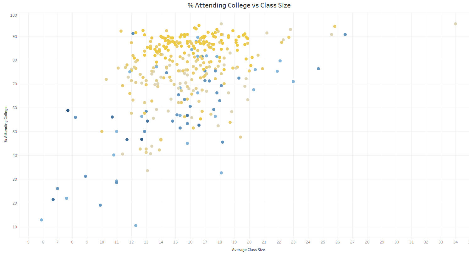
The scatter plot graph exhibits two distinct colors, yellow and blue, representing different schools or classes, their attendance rates, class averages, and economic disadvantages. Notably, the yellow data points cluster closely together, indicating significantly higher attendance rates compared to the blue data points, which represent students who do not attend college. The collected data reveals that out of a total of 953,747 students, 791,610 successfully graduated, while 162,137 did not complete their education. Additionally, 585,791 students pursued higher education after graduating, while 205,818 did not attend college.The evident disparity raises questions about the underlying causes and possible solutions to improve attendance rates and ensure students graduate. These concerns often dominate board meetings, creating an atmosphere filled with fear, worry, doubt, anguish, and apprehension.
How does class size affect college admission?Nevertheless, the data analysis reveals that the relationship between class size and college attendance is not straightforward. While there is a predominant trend of higher college attendance rates among students in class sizes ranging from approximately 17.7 to 21.4, there are outliers to consider. Specifically, a group of economically disadvantaged students with remarkably small class sizes of 9 to 16 students exhibits low college attendance rates.
Top Schools with the Highest Passing Rate
The Secretary of Education believes that 4th grade math is key to a student's feature & would like to focus on improving the state's MCAS 4thGrade Math P-value (P stands for passing). They want to know which districts are above the desired threshold of 50% & would like to collect the names of these districts to invite some of these teachers to train the rest of the state on how they improve math scores.
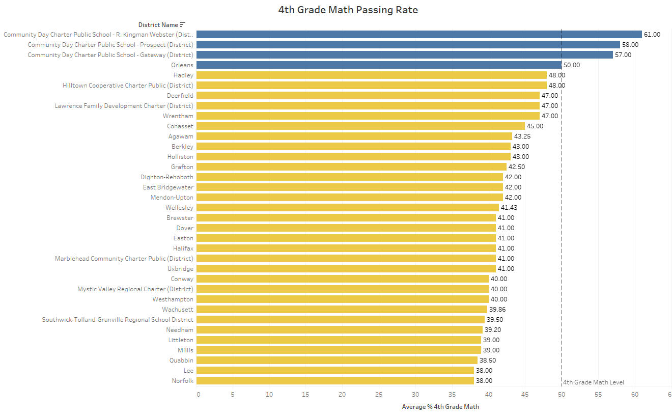
What are the top math schools in the state?By analyzing a bar graph, it becomes evident that out of the 111 school districts, only four districts—R. Kingman Webster, Prospect, Gateway, and Orleans—achieved a passing rate in Math. Surpassing the threshold with an average passing rate of just 50% or higher, the question arises as to why only these four districts succeeded while the others failed. To explore this further, extensive research was conducted, revealing multiple online sources that shed light on the situation.According to a report from Boston Local news, “recent data from the National Assessment of Educational Progress (NAEP) indicates that Massachusetts' scores in reading and math exams for fourth and eighth-grade students have reached a 19-year low. Furthermore, Massachusetts no longer maintains its top position in fourth-grade math scores.While a decline in scores has been observed since 2017, the sharp drop from 2019 to 2022 is primarily attributed to the disruptive impact of the pandemic on learning. Nationally, math scores witnessed their largest decrease ever, while reading scores regressed to levels last seen in 1992. Alarmingly, nearly four in ten eighth graders struggled to grasp basic math concepts. Notably, no state demonstrated a significant improvement in average test scores, with some states barely maintaining the status quo.These findings originate from the NAEP, which conducted assessments on hundreds of thousands of fourth-grade students across the country this year. Given that this test was the first nationally representative study of the pandemic's impact on learning since 2019, it provides valuable insights into the repercussions of the ongoing crisis.”For more information into this section here is the link: Massachusetts Education
What schools are struggling the most?Between 2018-2021, the struggles observed in Massachusetts 107 district schools that has not passed the 50% threshold, can indeed be attributed to the impact of the COVID-19 pandemic on education. The disruptive effects of the pandemic on teachers and students' learning experiences have been significant and widespread.The shift to remote or hybrid learning models due to lockdowns and safety measures presented numerous challenges. Remote learning often lacked the same level of engagement and interaction as traditional classroom settings, making it harder for students to grasp complex math concepts effectively.Furthermore, the emotional and mental toll of the pandemic cannot be overlooked. Many students faced increased stress, anxiety, and social isolation, which can impact their ability to focus and engage with academic content.It's important to note that Massachusetts is not alone in experiencing these challenges. The pandemic has affected educational systems worldwide, and similar struggles have been observed in many other regions and countries.
What are the bottom 10 high schools in terms of Graduation percentage?
In this section, I provided this data to identify the ten lowest-performing high schools in terms of graduation rates. These schools include:
Curtis-Tufts,
Springfield Public Day High School,
Boston Day and Evening Academy Charter School,
Whaling City Junior/Senior High School,
Springfield High School,
Phoenix Academy Lawrence,
Chicopee Academy,
Dorchester Academy,
Gateway to College at Springfield Technical Community College, and
Haverhill Alternative School.Each of these schools had a graduation percentile of less than 20%.
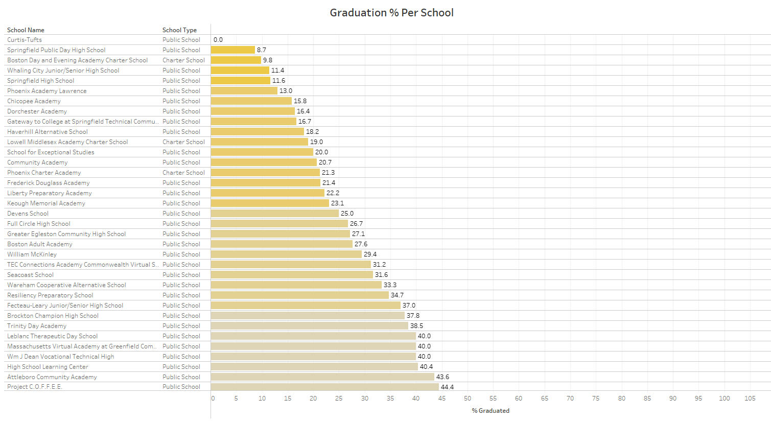
During the analysis, the data was sorted in ascending order based on the graduation rates, with the schools exhibiting the lowest graduation percentages positioned at the top. One particular observation of interest was Curtis-Tufts High School, which displayed an alarmingly low graduation rate of 0%. Intrigued by this finding, further investigation was conducted online, uncovering the fact that Curtis-Tufts High School functions as a therapeutic school that facilitates the transition of students to other educational institutions for the purpose of graduation.After doing more research, Curtis-Tufts High School stands out as more than just a conventional public school, as it offers specialized support to students facing social-emotional and behavioral challenges. These challenges encompass a range of conditions, including anxiety/panic disorder, attention deficit hyperactivity disorder (ADHD), bipolar disorder, depression, obsessive-compulsive disorder, school phobia, self-harm issues, and emotional/physical trauma.The primary objective of Curtis-Tufts High School is to provide assistance to students, ensuring they can navigate the educational environment effectively. The school focuses on improving attendance, fostering motivation, and nurturing students' integrity and confidence as they confront the challenges life presents. Parents place their trust in Curtis-Tufts High School when their children grapple with these difficulties, knowing that the school is equipped to facilitate their growth and prepare them for future success.By providing tailored support and guidance, Curtis-Tufts High School empowers students to develop the necessary skills and resilience to overcome obstacles and transition successfully to another institution, ultimately enabling them to achieve their academic goals and build a promising future!For more information into this section here is the link: Curtis-Tufts High School
Would you recommend the state build more schools for this purpose?
When considering whether the state should build more schools to address the challenges faced by students, I would advise against it. My opinion stems from the fact that simply constructing new schools may not necessarily solve the underlying issues if students continue to struggle attending classes and performing poorly. It is crucial to approach this matter from a realistic perspective.Building new schools involves a HUGE financial investments, and it is important to assess whether such investments will truly yield positive outcomes. Instead of allocating resources to construct new schools, an alternative approach could be to focus on other areas of improvement within the education system.One potential avenue for improvement is investing in teachers by increasing their salaries or conducting a comprehensive analysis of teacher performance across the state. By evaluating teachers' success rates and identifying those who demonstrate a genuine passion for helping students succeed, the state can prioritize attracting and retaining educators who are truly dedicated to their profession.Acknowledging the hard truth, it is necessary to recognize that some teachers may lack the passion and commitment required to inspire and engage students effectively. Therefore, efforts should be made to identify and recruit educators who genuinely enjoy teaching children and possess the skills to create a positive learning environment that motivates students to eagerly return to class.Ultimately, improving educational outcomes requires a careful approach that addresses various factors, including teacher quality, curriculum enhancement, parental involvement, and student support systems. It is essential to carefully consider the most effective and impactful strategies that will benefit students in the long run.
My Tableau Dashboard Overview of Massachusetts Education
In this section, I designed a dashboard that encompasses all my findings derived from the analysis conducted on this amazing journey.
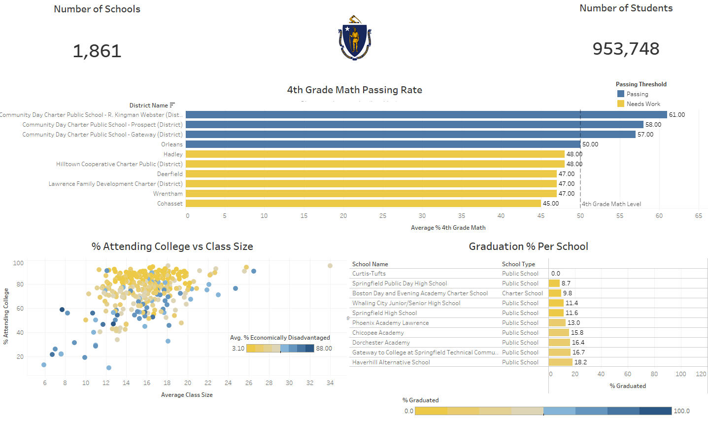
If you want to take a look at my dashboard click on the link here: Tableau Dashboard
My Final Progress through this Analysis
Investigate schools and conduct a weekly school board meeting with all teachers about class attendance, student-teacher ratio, and providing Teacher Assistance to help both students and teachers in each classroom.
The State will observe school districts that has top performing academic success in math and figure out how other school districts can do the same.
The Secretary of Education will meet with all school districts and determine to improve their educational environment to both teachers and students.
The 10 lowest high school performers with an average graduation rate of 20%. The board members will conduct ways to change and improve their academic success.
Rather than building more schools, the board members must focus more on building a new program, analyze each teacher on their performance, those who have a passion to helping students, and create a positive learning environment.
"For we live by Faith, not by Sight."
- 2 Corinthians 5:7
SQL
World Banking Analysis Project
In 2015, Nepal captured global attention on April 25th when a powerful 7.8 magnitude earthquake struck the nation. This devastating earthquake claimed nearly 9,000 lives, displaced thousands, and caused over $7 billion in physical damages. The news of this catastrophe rapidly spread worldwide, leading to an outpouring of mourning and prayers for Nepal's recovery from the climate-related risks it confronted.However, it is crucial to recognize that Nepal is not alone in facing climate change challenges. Throughout the South Asia Region, numerous countries are confronted with similar adversities each year, making them the most vulnerable in Asia.

Why This Project?As a Data Analyst aspiring to venture into the world of Finance while also expanding my expertise in SQL, this project presents a captivating challenge that aligns perfectly with my interests. I thoroughly enjoy tackling complex questions and employing SQL to analyze extensive datasets, all while effectively communicating my findings to the audience.Working on a project that involves data from the World Bank, which supports countries in need of financial assistance worldwide, adds an extra layer of significance to my endeavors. This opportunity will put my analytical skills to the test, especially when dealing with financial figures and assessments. By the project's conclusion, I anticipate gaining invaluable experience in handling financial data, which will contribute to my growth and success in the realm of data analytics.
The DataThe dataset was downloaded from the World Bank’s website. You can access the dataset here: World Bank Group Finances
Key Questions
After looking at the dataset from the World Bank website, I decided to focus Nepal on the South Asia Region for this project primarily because it is facing significant challenges related to climate change. Recognizing the urgency and relevance of environmental issues, I aim to contribute my skills as a Data Analyst to better understand and address the impacts of climate change in this vulnerable region.

South Asia has been experiencing a rise in climate-related disasters, including extreme weather events, rising sea levels, floods, and droughts. These changes directly affect millions of people's lives, economies, and natural ecosystems. By focusing on this region, I seek to analyze and interpret large datasets related to climate, weather patterns, and environmental indicators, using my expertise in SQL to extract meaningful insights. My Key questions going into this analysis were:
What was the total amount in U.S. dollars provided by the IDA to Nepal?
How many total transactions in Nepal?
What are the names of the top 5 projects the IDA has extended money to Nepal?
Which project(s) the IDA has impacted the most to Nepal?
Which project the IDA has extended money to Nepal that was canceled?
What was the average amount Nepal received from IDA?
Key Insights
Using SQL, I was able to gain these key insights from my questions:What was the total amount in U.S. dollars provided by the IDA to Nepal?$7,723,357,267.25How many total transactions in Nepal?22,088 TransactionsWhat are the names of the top 5 projects the IDA has extended money to Nepal?Earthquake Housing Reconstruction Project ($300,000,000)
Strategic Road and Trade Improvement ($300,000,000)
ACCESS - Nepal Phase 1 Project ($275,000,000)
Nepal Fiscal Reforms DPC ($200,000,000)
Finance for Growth (F4G) ($200,000,000)Which project the IDA has impacted the most to Nepal?Earthquake Housing Reconstruction
Strategic Road and Trade ImprovementWhich project the IDA has extended money to Nepal that was canceled?URB WATER & SAN REHAB - CLOSED(T) ($45,757,993.36)What was the average amount Nepal received from IDA?$18,166,201.94
SQL AnalysisSQL is the best tool for handling large datasets due to its efficiency and scalability. Its optimized query processing allows for quick retrieval and manipulation of vast amounts of data. In the case of this dataset, there were 1,048,576 rows of data. As a best practice, it is essential to include clear annotations above each query. This ensures that other data analysts can easily follow the analysis and even offer suggestions to enhance query efficiency when reviewing my work.
What was the total amount in U.S. dollars provided by the IDA to Nepal?
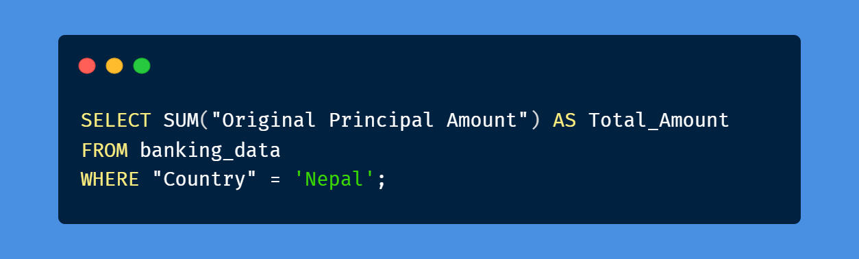
Through an SQL query, the analysis revealed that Nepal received a significant loan amount of $7,723,357,267.25, aimed at rebuilding infrastructure affected by climate change and bolstering resilience against future climate-related disasters. However, Nepal has faced additional challenges, including numerous natural disasters and the 2020 COVID-19 pandemic, which further impacted the nation's economic recovery efforts. Addressing these challenges requires an approach to ensure a sustainable future for Nepal.
How many total transactions in Nepal?

Through an SQL query, the analysis revealed this period marked by climate change challenges, it's important to note that a total of 22,088 transactions were conducted by the International Development Association (IDA) to support Nepal. These transactions represent a significant commitment to assist Nepal in addressing the impacts of climate change and related challenges.
What are the names of the top 5 projects the IDA has extended money to Nepal?
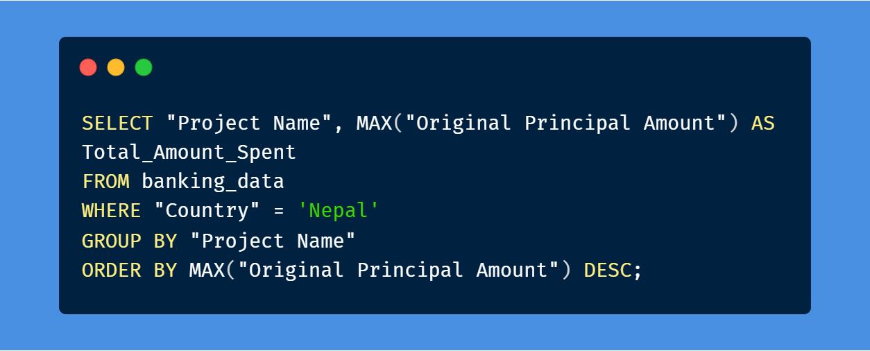
Through this section along with the SQL query, this analysis revealed the top 5 projects that was used to help Nepal. The projects listed below:1. Earthquake Housing Reconstruction Project ($300,000,000)The Earthquake Housing Reconstruction Project in Nepal aimed to rehabilitate and rebuild housing infrastructure following the devastating earthquake in 2015. Utilizing an SQL query to analyze the data, the total cost for this project is at $300,000,000. One of the notable projects, with the highest original principal amount, stands out as a significant initiative in this reconstruction endeavor. For more insights into these approaches, refer to the World Bank's comprehensive overview: Lessons in Earthquake Reconstruction.

2. Strategic Road and Trade Improvement ($300,000,000)The Strategic Road and Trade Improvement Project in Nepal aimed to enhance road connectivity and facilitate trade within the country. Utilizing an SQL query to analyze the data, the total cost for this project is at $300,000,000. Using an SQL query, it's evident that this project played a crucial role in improving infrastructure. For further details on the impact and significance of this initiative, you can refer to the World Bank's official page: Nepal Strategic Road Connectivity and Trade Improvement Project.Climate change has significantly impacted Nepal, affecting road infrastructure due to the increased occurrence of extreme weather events such as floods and landslides. As Nepal rebuilds its roads and infrastructure, addressing climate change resilience becomes paramount to ensure the longevity and sustainability of these improvements.
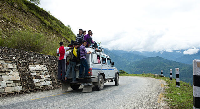
3. ACCESS - Nepal Phase 1 Project ($275,000,000)The ACCESS - Nepal Phase 1 Project holds the potential to instigate profound shifts in material transportation dynamics, by providing as a key component to the economies of South Asia. The program is used to yield outcomes for trade operations, providing improvements in paper-based and manual trade procedures, enhancements to trade-related infrastructure, mitigation of transport deficiencies, and provide restrictive trade and transport protocols. The core developmental aim revolves around augmenting the trade and transportation systems within specified corridors across Nepal.For more information: ACCESS - Nepal Phase 1 Project

4. Nepal Fiscal Reforms DPC ($200,000,000)The Nepal Fiscal Reforms DPC (Development Partner Center) proposed operation will support the Government of Nepal in its efforts to establish a framework to move towards fiscal federalism and improve public financial management. From the SQL query, this project cost is at $200,000,000.What is a Fiscal Reform/Policy?Fiscal policy refers to the use of government spending and tax policies to influence economic conditions, especially macroeconomic conditions. These include aggregate demand for goods and services, employment, inflation, and economic growth.The proposed operation aims to support the government’s transition from a centralized to a federal structure and reforms that enhance Public Financial Management (PFM). The activities of the project are organized under two pillars:(i) Establish a framework to move towards federalism(ii) Improve the policy framework for PFMThe main development challenges faced by the country include fragility stemming from limited government capacity, political instability, as well as natural disaster related risks. The country had nine governments over the past 10 years and was hit by three large exogenous shocks in the past three years: earthquake (2015), trade blockade with India (2016) and floods (2017).
5. Finance for Growth (F4G) ($200,000,000)With the project estimated at $200,000,000, the Finance for Growth Development Policy Credit (DPC) Project is geared towards aiding the Government of Nepal in enhancing financial sector stability, expanding the range of financial offerings, and facilitating broader accessibility to financial services. This effort is designed to bolster Nepal's financial landscape, fostering economic growth and resilience.
Which project the IDA has impacted the most to Nepal?
Earthquake Housing Reconstruction
Strategic Road and Trade Improvement
Both the Earthquake Housing Reconstruction and the Strategic Road and Trade Improvement projects, each funded at $300,000,000, have left a profound mark on Nepal's landscape, especially considering the climatic changes that transpired over the last decade. The Earthquake Housing Reconstruction project has significantly contributed to rebuilding and fortifying housing infrastructure following the devastating earthquake of 2015. Given Nepal's vulnerability to climate-related disasters, this initiative has not only restored physical structures but has also helped communities become more resilient to future environmental challenges.Likewise, the Strategic Road and Trade Improvement project has played a vital role in enhancing connectivity and trade networks within the country. Improved road infrastructure is crucial for effective disaster response and recovery, considering Nepal's susceptibility to natural calamities. Furthermore, this initiative holds particular significance due to the climate change-induced impacts that the nation has faced, such as floods and landslides.However, it's important to acknowledge that these efforts have taken place amidst another significant global crisis—the COVID-19 pandemic in 2020. The pandemic's economic ramifications further highlighted the importance of robust infrastructure, including road networks for trade and transportation, in facilitating essential supplies and sustaining economic activities during such challenging times.
Which project the IDA has extended money to Nepal that was canceled?

URB WATER & SAN REHAB - CLOSED(T) Project had the extended amount of $45,757,993.36 received by the IDA was canceled. Why was it canceled? According to the GWP Nepal, “The Urban Water Supply and Sanitation Policy (UWSSP) was formulated to address the complex operational issues of urban water supply and sanitation service delivery.It also addressed the need of an umbrella policy to achieve coherent, consistent and uniform approaches of development sector in urban areas by all effectiveness for improved service delivery in proper perspectives according to the need of the day. While working on this project, it appeared to have more complications with the urban water supply and will have to spend more money on this project than expected, which the IDA had no other choice but the canceled it.
What was the average amount Nepal received from IDA?

The query returned $18,166,201.94 as the average amount the IDA has loaned to Nepal to help rebuild a stronger road and housing infrastructures development.
Conclusion
Based on a thorough analysis with this project, we learned several key insights through this research:
In 2015, Nepal faced a catastrophic 7.8 magnitude earthquake, resulting in significant loss of life, displacement, and massive physical damage amounting to over $7 billion. The global response to this disaster highlighted the urgent need for recovery from climate-related risks.
The challenges posed by climate change are not unique to Nepal; the entire South Asia Region confronts similar vulnerabilities. Extreme weather events, floods, rising sea levels, and droughts threaten millions of lives, economies, and ecosystems.
The "Finance for Growth DPC" initiative focuses on strengthening Nepal's financial sector stability, diversifying financial solutions, and improving access to financial services. This project holds significance in boosting economic growth and resilience in Nepal.
The projects "Earthquake Housing Reconstruction" and "Strategic Road and Trade Improvement," each funded at $300,000,000, have left a profound impact. The former aids in rebuilding housing post-earthquake, bolstering climate resilience. The latter enhances connectivity and trade, addressing the impact of climate change-induced disasters.
COVID-19, a global pandemic in 2020, highlighted the importance of robust infrastructure. Effective road networks and transportation systems proved crucial in facilitating essential supplies and economic sustenance during crises.
The "ACCESS - Nepal Phase 1 Project" and other similar efforts demonstrate Nepal's commitment to building forward post-disaster. With robust reconstruction and resilience strategies, the region aims to mitigate capital and humanitarian costs.
Data analysis through SQL yielded valuable insights. Notably, Nepal received a loan of $7,723,357,267.25 for rebuilding infrastructure affected by climate change. The average loan amount was approximately $18,166,201.94.
The cancellation of the "URB WATER & SAN REHAB - CLOSED(T)" project, which received an extended amount of $45,757,993.36, exemplifies the complexities of infrastructure development and the need for adaptable strategies.
Overall, these projects and analyses underscore the importance of resilience, sustainable infrastructure, and collaborative efforts in addressing climate change impacts and other unexpected challenges that Nepal and the region continue to face.I'd like to express my gratitude for taking the time to review my work. I hope to receive your insights and comments. It has been an incredible journey with this project, and I eagerly anticipate upcoming projects. Please feel free to connect with me here, and let's thrive together in the world of data!
"My soul faints with longing for your salvation,
but I have put my hope in your word."
- Psalm 119:81
SQL & Power BI
Department Operation Project

Project Overview
This project involves developing a dashboard for workforce management, financial risk assessment, and project health monitoring. The main goal is to identify departments and projects at risk of being over budget or underperforming.
Data analysis project to develop a dashboard for workforce management, financial risk assessment, and project health monitoring
Key focus: Identifying projects and departments at risk of being over budget or under-performing
Key Objectives
Identify departments and projects in the red for corrective action
Organize data from various sources for effective reporting
Develop a comprehensive Power BI dashboard for visibility into employee performance, salary distribution, and project management
Data Processing
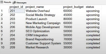
Data cleansing and sorting performed using Microsoft SQL, addressing duplicated rows and creating a "Main Table"
CTE format used to combine project status and main table data
Dashboard Components
Table view created showing department names, goals, budgets, salaries, project costs, capital, and 2-year budgets
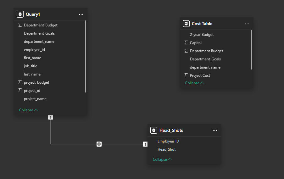
Data model designed with three main tables (Query1, Cost Table, and Head_Shots) for comprehensive analysis of departmental performance, project statuses, and employee details
Email Request by Manager
This project involves developing a dashboard for workforce management, financial risk assessment, and project health monitoring. The main goal is to identify departments and projects at risk of being over budget or under-performing.
Identify Departments and Projects in the Red: Understand which departments or projects are over budget or under-performing, so we can take corrective action.
Data Organization: Ensure that data from various sources (e.g., employee information, salary data, department budgets, and project details) is structured correctly and accessible or reporting.
Power BI Dashboard Development: Collaborate with us to create a comprehensive dashboard that provides visibility into employee performance, salary distribution, and department project management.
Project & Main Table Analysis
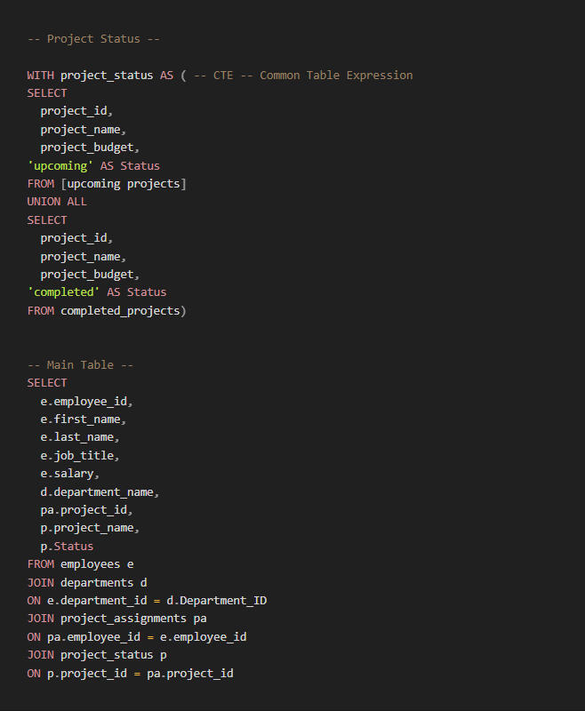
From an analytical standpoint, the SQL code provided demonstrates a well-structured approach to data integration and analysis for the project overview dashboard. Here's a detailed explanation:
Data Integration
The code uses a Common Table Expression (CTE) named 'projectstatus' to combine data from two separate tables: 'upcoming projects' and 'completedprojects'. This integration allows for a unified view of all projects, regardless of their status.
Data Transformation
The CTE adds a 'Status' column, explicitly labeling each project as either 'upcoming' or 'completed'. This transformation enhances the analytical capabilities by allowing for easy filtering and grouping of projects based on their status.
Comprehensive Data Model
The main query joins multiple tables (employees, departments, project__assignments, and the projectstatus CTE) to create a rich, denormalized dataset. This approach brings together diverse information into a single view, facilitating complex analyses without the need for multiple queries.
Employee-Project-Department Linkage
The joins in the main query establish clear relationships between employees, their departments, and the projects they're assigned to. This linkage is crucial for analyzing workforce allocation, departmental performance, and project staffing.
Analytical Possibilities
The resulting dataset enables various analyses, such as:
Project distribution across departments
Employee workload and project assignments
Salary distribution in relation to project involvement
Department-wise project status overview
Performance Considerations
The use of a CTE and multiple joins might impact query performance for large datasets. However, it provides a clean, modular structure that can be easily modified or expanded for future analytical needs.
This SQL structure aligns well with the project objectives, particularly in organizing data from various sources for effective reporting and identifying departments and projects at risk of being over budget or under-performing. It sets a solid foundation for developing the comprehensive Power BI dashboard mentioned in the project overview.
SQL Coding Analysis
The SQL code provided in the context demonstrates the use of two main components:
Project Status CTE (Common Table Expression): This CTE combines data from "upcoming projects" and "completed_projects" tables to create a unified view of project statuses.
Main Table Query: This query joins multiple tables (employees, departments, projectassignments, and the projectstatus CTE) to create a comprehensive dataset with employee and project information.
The resulting dataset includes the following details:
Employee information: ID, first name, last name, job title, and salary
Department name
Project information: ID, name, and status (upcoming or completed)
This SQL code is designed to organize and combine data from various sources, addressing the requirement to structure data correctly for reporting purposes, as mentioned in the project overview.
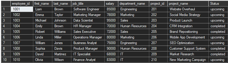
Table ViewFor this section, I have setup a table view of Department Name, Goals, Budget, Salary, Project Cost, Capital, and 2-year Budget. Filling each information as requested and figuring out how much each project would cost in each department, what are the goals, and how much budget is left within each department.The image shows a table view of department-related information. Here's a detailed description of its contents:
The table has 7 columns: Department Name, Department Goals, Department Budget, Salary, Project Cost, Capital, and 2-year Budget.
It displays data for 5 departments: Engineering, Marketing, Sales, Human Resources, and IT.

Each department has specific goals listed:
Engineering: Develop new products
Marketing: Increase brand awareness
Sales: Boost sales
Human Resources: Enhance employee engagement
IT: Improve IT infrastructure
Department budgets range from $800,000 (Human Resources) to $2,400,000 (Engineering).
Salaries vary across departments, with the highest being $167,000 (Sales) and the lowest $151,000 (IT).
Project costs are listed for each department, ranging from $90,000 (IT) to $150,000 (Sales).
Capital amounts are shown, with the highest being $770,000 for Engineering and the lowest being $58,000 for IT.
The 2-year budget column shows allocations ranging from 400,000 to 1,200,000, with Engineering having the highest budget.
Interestingly, the Human Resources department shows a negative value (-$25,000) in the Project Cost column, which might indicate a cost saving or revenue generation from their projects.
This table provides a comprehensive overview of each department's financial allocations, goals, and project costs, allowing for easy comparison and analysis across the organization.
Data Modeling
The image shows a data modeling diagram for a Power BI project. This diagram illustrates the relationships between different tables in a database or data warehouse. Here's a detailed description of what we can see:
There are three main tables or entities visible in the image: "Query1", "Cost Table", and "Head_Shots".
The "Query1" table appears to be the most comprehensive, containing fields such as Department Budget, Department Goals, departmentname, employeeid, firstname, jobtitle, lastname, projectbudget, projectid, and projectname.
The "Cost Table" includes fields like 2-year Budget, Capital, Department Budget, DepartmentGoals, departmentname, and Project Cost.
The "HeadShots" table is the simplest, containing only EmployeeID and Head_Shot fields.
Lines connecting these tables indicate relationships between them. There's a "1" at the end of each line, suggesting one-to-one relationships between the tables.
The layout suggests a star schema design, with Query1 potentially serving as a fact table and the others as dimension tables.
This data model appears to be designed for analyzing project and department budgets, employee information, and potentially visualizing employee headshots. It would allow for comprehensive reporting on departmental performance, project statuses, and individual employee details.
My Final Progress through this Analysis
This project provided an excellent opportunity to delve deep into data analysis, using Power BI and SQL to create meaningful visualizations and insights. Working on this dashboard allowed me to enhance my skills in data modeling, visualization, and storytelling.
This project displays key information about various department goals, project costs, and budgets within the company. Here’s a summary of the key insights from the dashboard:
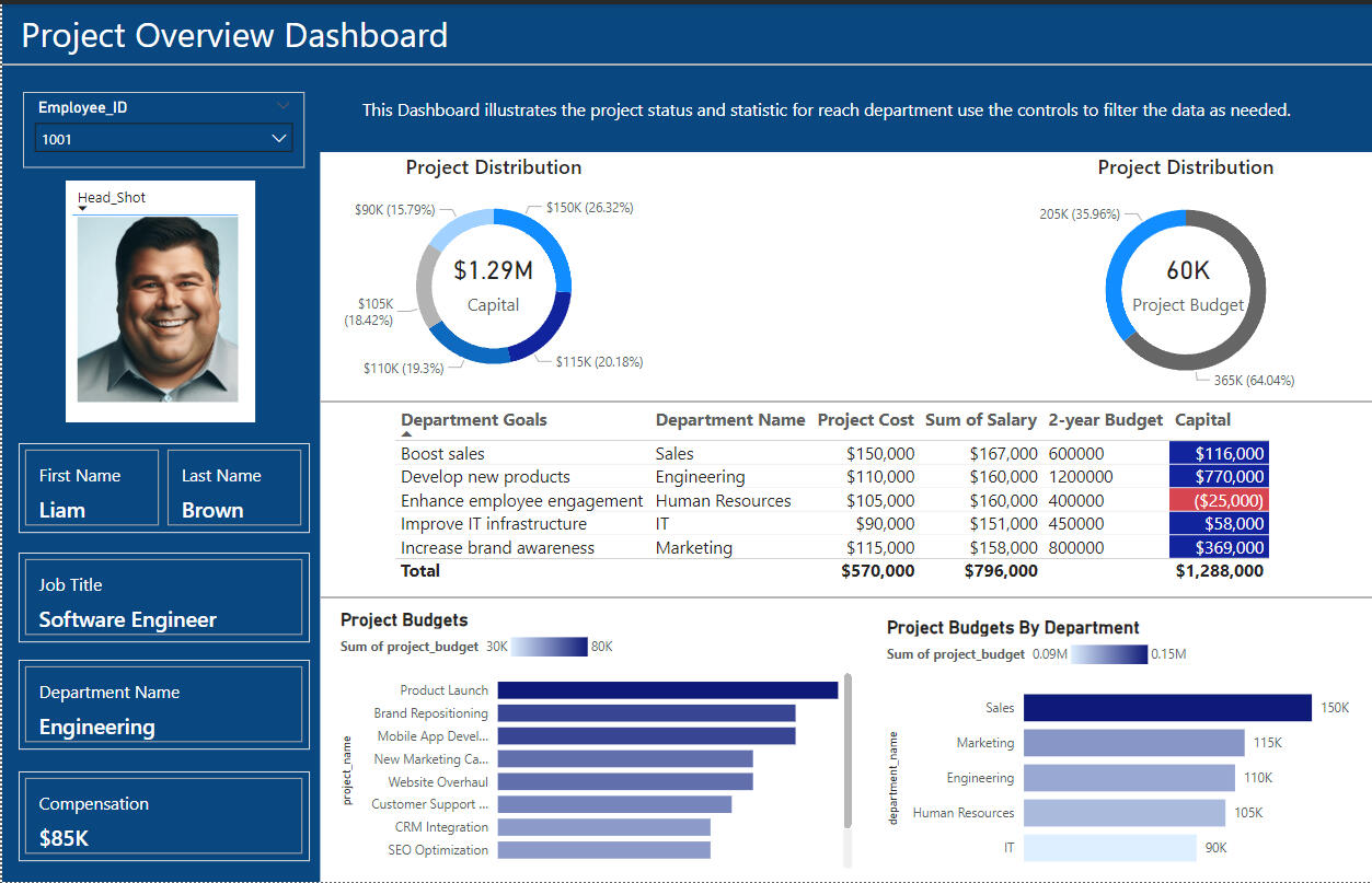
Employee Details
The dashboard is focused on Liam Brown, a Software Engineer in the Engineering department, with a compensation of $85K.
Project Distribution
Capital Allocation: A total of $1.29M is distributed across different projects, with significant allocations including $150K (26.32%) to Sales and $115K (20.18%) to Marketing.
Project Budget: The budget distribution consists of $60K and $205K for various departments, with a total allocation of $365K.
Department Goals and Budgets
Various departments have distinct goals such as boosting sales, developing new products, and enhancing employee engagement.
The total project costs amount to $570K, while the sum of salaries is $796K and the 2-year budget totals $1.29M.
Notably, the Human Resources department has a capital deficit of $25K.
Project Budgets by Department
The Sales department has the highest budget at $150K, followed by Marketing at $115K, while IT has the smallest allocation at $90K.

Thank you once again for taking the time to review my project analysis! I truly enjoyed working on this project and sharing the insights I've uncovered. In the world of data, there's always room for growth, and that's why I’m committed to continually learning and evolving as a Data Analyst.I consider myself a lifelong student of data, driven by a passion for uncovering insights and providing answers. My journey of learning never stops, and I’m excited to keep growing in this field.
Thank you!
Sed enim lorem ullamcorper dolore. ac varius enim dolore. Proin aliquam facilisis.